
Problem
Individuals frequently have problems maintaining good posture, which results in back pain. Attempts have been made to remedy this through design solutions like ergonomic chairs, or padding chairs to make them more comfortable; however, this doesn’t address the main issue of poor posture—in fact, comfortable or ergonomic chairs might cause individuals to sit in them longer without actually fixing their posture, simply increasing their pain.
Solution
Concentration Workspace is an app mockup that would “lock” the rest of the phone, in order to keep the individual focused. It includes a customizable section of apps that are useful to the user’s current task, which would display a focus mode; for example, the user could enable a calculator app while doing math homework, or a to-do list app while doing a gym workout to track their workout routine.
Posture reminders would be constantly visible on the screen when focus assist was activated, to stay true to the original focus of our observations; over time, this would hopefully engrain itself in users’ memory, such that they begin fixing their posture even without the constant reminders. To accommodate potential emergencies, the user could also mark certain apps or contacts as urgent; notifications from “urgent” apps/contacts would show up regardless of whether the focus assist mode on the app was turned on.


Wireframes


Using Figma, and photoshop, we translated our first sketches into low-fidelity wireframes. Then, we improved them after each user testing session. At this stage, the wireframes were defined enough for some user testing. Based on 4 tests, we made a few alternations and moved on to creating high-fidelity prototypes.
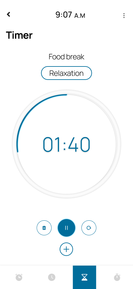
Prototypes


Usability Testing
Created a fully functional, high-fidelity prototype using tools such as Figma, Photoshop, and Illustrator. At the same time, we started recruiting subjects for the test who fit our criteria. We did 4 usability tests in total, each with one scenario presented to the users.
Issues from the second round of testing
App selection during initial session setup: users wanted a list of app icons to choose from, the ability to make and save presets for screen layouts, and for social media/browser apps to be disallowed.
General visual design, notably making the interface less cramped.
Handling when users try to exit the app: showing notifications with how long the user had been away, and repeatedly reminding them to get back
Users mentioned that there should be a settings menu
Solutions
General visual design: simplified the app design, reducing text and adding icons where possible, particularly on the home screen.
Added a settings and information button to the bottom of the home screen.
Design process
Methods
- Interviews
- Systems mapping
- User research
- Wireframing
- Hi-fidelity and low-fidelity prototyping
- Usability Testing
Tools
- Photoshop
- Balsamiq
- Figma
- Illustrator
- Phone (recording user interviews)
Timeline
- Overall: 7+ weeks
- Discover & research: 3 weeks
- Design & testing: 6 weeks
Thank you for reading my case study!
Check out my thorough case study for the other project: Ucritic
Email me at ashutosh.sharma2001@outlook.com