
Approach
We wanted to create a whole new wave of social self-expression by giving users the tools to easily make and share in 360º. We studied the market and at the time no network gave users the power to easily create and live stream in 360º. We came up with 3 features that allow users to fully express themselves in 360. They can capture and edit their own content, live stream to a public audience, and have a private call with a friend in VR.
We wanted to create a whole new wave of social self-expression by giving users the tools to easily make and share in 360º


Problem
After only a few tests with users we found a handful of pain points that users were routinely running into. The drop down to choose between a public live stream and a private call was difficult to find and understood by most users. Once they did find it and chose to make a call, hiding the call icon behind an arrow confused them and they typically tried selecting the profile picture instead to make a call. Once they completed all these tasks, they were still left with having to connect a 360 camera. The notification to connect a camera was not clear enough and made them confused as to why they couldn't begin to stream.
Users were having a difficult time discovering how to toggle between Public and Private, in addition to finding the call option once in the contacts list.


A New Approach
I went back to the drawing board and tried to make everything as fool proof as possible. I started with creating a completely new navigation. This was to make the distinction between going live and making a 1-on-1 call as straight forward as possible. If the user selects go live, and the camera is not connected, they are immediately shown a prompt to connect a camera. In the contacts list, I placed the camera icon more visible and gave access to information informing the user how to make a call. I also made slight improvements to the feed, and media player ui in order to make the usability as clear and user friendly as possible.

Feed
Aside from changing the navigation, I made changes to the thumbnail UI, made the search feature more clear, and accounted for more features like location, hashtags, sharing, liking, and commenting.


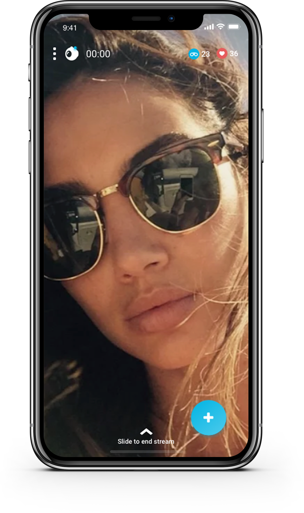
Streaming in 360º
Once the user selects 'Go Live' from the navigation, and the camera is not connected, they will immediately be met with a modal pop up that instructs them to connect a camera. This has shown to be much more effective with getting the user set up to stream. I redesigned the setup screen with clear instructions and what is needed before going live. Overall this flow has dramatically improved the speed in which a user can start a stream.


Profile
For the profile, I removed the upload icon and placed it in the navigation. I also gave an option to immediately edit your profile instead of having to go through the settings. The activities section deserved its own page, and I made a section specifically for 'following back' friends. Or, in the future, responding to requests.


Other Improvements
I found that communication amongst the users is key. Users were continually expressing their enjoyment of being able to comment and receive comments within the app, but our feature set for communication was not robust enough. We since have added the ability to tag users as well as create separate chat rooms for people to connect with their friends more intimately. In addition, we matured our editing kit and simplified the media player ui.


VR Demo
The goal is to be able to use and interact inside this app all in VR mode. This is a little demo testing out some ideas for how it might work.